Gavilan College
CSIS 6/ DM 6/

Webpage Authoring

Lesson 13:
Designing a Website

Designing your Website

Designing a website is NOT about:

  • writing HTML code.
    • Inspite of all the wonderful tags you've learned, your final webpage is a combination of more than fancy tag manipulation. Designing a webpage takes a unique blend of publishing awareness, user interface design, color theory, and technology.

  • creating fancy graphics.
    • The bigger and fancier your graphics are, the slower your pages will load. Some people who study web users claim that the World Wide Web is a medium created for the attention deficit disorder crowd. Nobody wants to wait more than 13 seconds for a page to load.

  • designing for the print medium - newspapers, magazines, flyers, or any other print material.
    • Too many web designers create pages that are designed like a typical 8 1/2" x 11" piece of paper. The typical monitor, however, is more like a page on its end - 11" x 8 1/2" - a definite horizontal, rather than vertical plan. A good rule of thumb is to design your pages to be no wider than 800 pixels. The length can be longer, but to see anything beyond the height of the screen, the user will have to scroll.

  • designing a permanent creation.
    • While it is possible, with Cascading Style Sheets (Lessons 13 to 16), to get very precise layouts, it will never be as precise as print. If you can remember that as you're designing your Web pages, you'll save yourself a lot of stress.
    • When you build your web page and test it in your browser, you get it looking exactly how you want it. But then you test it in a different browser, and it looks different. And when you test it on a Mac or a PC, it looks different still.
    • Try to control the things you can, accept the things you can't, and hopefully have the wisdom to know the difference. You've probably heard that before.

Color Theory

Besides color deficiencies in the sight of your readers, there are other issues about color you should consider. Color can be used to create a unifying theme, visual interest, or a certain mood. J.L Morton in her Color Matters website, says that color provides the harmony. When something is not harmonious, it is either under-stimulating and boring, or so chaotic that the reader can't stand to look at it. She describes different ways to select your color scheme:
Analogous colors are any three colors which are side by side on a 12 part color wheel, such as yellow-green, yellow, and yellow-orange. Usually one of the three colors predominates. leaf image
Complementary colors are any two colors which are directly opposite each other, such as red and green and red-purple and yellow-green. complementary colors

Individual Colors

Pink

Soothing, relaxing, fresh, sensuous, restful, and sweet, but also inspires passion, romance, and love.

Red

Trustworthy, warm, fun, sacred, hot, intense, angry, high energy, fire, blood and health. It can also mean Christmas. The examples below use bright splotches of red as accents.

Orange

Flamboyant, energetic, stimulating, sociable, friendly, but also associated with Thanksgiving, Halloween, autumn, nature, earth, luxury and heat.

Yellow

Earthiness, warmth, fun, energy, cheer, health, and hope. It's also related to nature, summer, inspiration, sunshine, deceit and cowardice. According to some color students, it’s the color that captures our attention more than any other color. Different cultures, however, have different associations. In China, adult movies are referred to as yellow movies. In Russia, an insane asylum used to be "yellow house."

Green

Soothing, relaxing, organic, calming, and fresh, also associated with nature, the environment, money and wealth, family and fertility, harmony and health, springtime and growth, but also jealousy and envy.

Blue

Stable, trustworthy, conservative, cool, calm and strong. It's also associated with power, water, trouble, depression, defeat, and mourning. But also superiority and patriotism.

Purple

Romantic, delicate, feminine, humble, pure, but also royalty, prosperity, wealth, nobility, mourning and death. And of course Easter.

Brown

Warm, conservative, earthy, natural and wholesome. Also age, nature, simplicity, comfort, honesty and steadiness.

Black

Evil, powerful, mournful, strong, sophisticated, formal and serious. Or trendy, stylish, chic and self-confident. Also associated with death and the night.

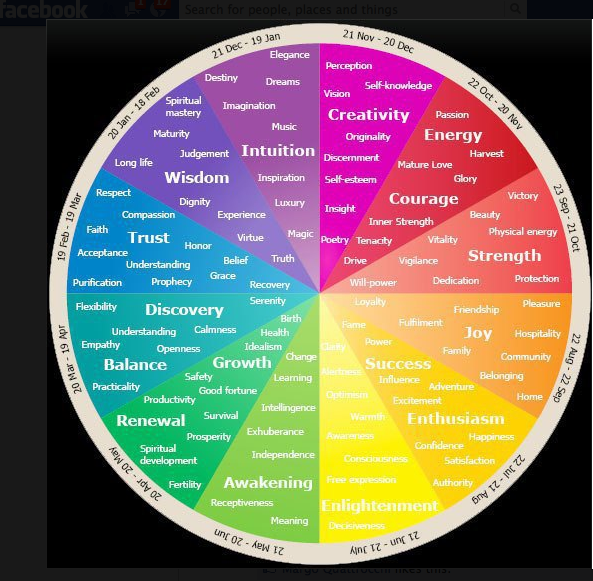
And just to add to the fun, here's a color wheel that matches up to signs of the zodiac. zodiac color wheel

Designing a website IS about:

  • Designing for the screen.
    Always keep in mind that your page has a horizontal basis - more width than height. The movie industry's "rule of thirds" uses this theory to place their focal point:

The rule of thirds theory:
Divide the screen into nine parts - 3 across, and 3 down.

  • The main focus of the first page of your website should be placed at one of the intersections of these dividing lines.
  • Some other element of the page should lead the eye toward the main focus.
  • The main focus should contrast with the background, either in color or in tone.

Look at the two images of the desert formations in the Wikipedia article. Which one do you like better?

  • Designing for the Attention Deficit Disorder crowd.
    Your readers will be different from newspaper and magazine readers. Jakob Nielsen, Internet scholar, has his own theory about web readers:

    The Jakob Nielsen Theory of Web Surfers:
    Surfers don't read. They scan. Therefore, pages should

    • Have scannable text: bold headings, highlighted keywords, bulleted or numbered lists.
    • Have one idea per paragraph,
    • Have the most important information at the top (before the user has to scroll).
    • Use meaningful subheadings and bulletted lists.
    • Have 50% fewer words.
  • Designing for the sight impaired.
    Any website you design for any kind of public entity needs to follow ADA guidelines that will enable it to be read by one of the 'readers' that blind surfers can use. This means:
    • All images should have those alt attributes. Every time you open an <img> tag, add an alt description.
    • Color schemes should take into consideration the fact that 12 to 20% of all white males are color-blind. Take this test to see if you have the same problem. And remember to design your pages so that everyone can read them.

Can you read the image to the right? Are the colors correct for what the words say? If you're color blind, chances are you can't tell. According to statistics, color blindness is a problem for 12 to 20% of males of European origin and about half a percent of females. For these people, the words in my picture appear to be almost the same color.

Color blindness is most commonly a lack of distinction between the colors red and green.

Red and green are often used to indicate "stop" and "go" in US culture. However, if you use them that way on your Web page, your purpose would be completely lost on a color blind person.

Here are some tips to make sure your pages are color blind friendly:
  1. Don't use only color to indicate something specific on your page.
    For example, if you have a form with required fields, making the text red might not be a big enough distinction for a color blind person. Add another cue, such as an icon or other element to indicate that the field is required.

  2. Avoid placing red and green together.
    Especially on items like navigation buttons, the text can blend into the background, making it very hard to read.

  3. Find a color blind friend or relative to look at your site.
    If you're not color blind it's often very difficult to be aware of problems.


Designing a website IS about layout:

Contrast Repetition Alignment Proximity
Borrowed heavily from Robin Williams, John Tollett, and Crystal Waters*

Contrast

  • Avoid a plain, text-heavy page with text that spreads from one side to the other. Studies show that white space, and shorter widths, are important to website readers. Reading speed can slow down by as much as 40% if there are no margins or white space, which makes the sentences hard to read.

  • Use backgrounds sparingly. If you really like backgrounds, pick one that contrasts with text and images, and is easy to read. If you have a busy background that you really want to use, set your text in tables with plain backgrounds, like this one. Imagine having to read the text off that background, if it weren't set into those nice clean plain-background tables.

  • Use contrasting text, varying the size, the color, and the weight (boldness). In the business cards below (in Proximity), the first card has two lines bolded in the center. The top line is one font size larger. The contrast isn't enough to really notice, just enough to make your readers wonder if this was a mistake. Contrast between the text and the background is also a huge issue. The latest trend in webpage design is to use gray text, but grey text is difficult to read, unless there is enough contrast. Other combos that should be avoided because they always strain the eye:

  • Black text on a red background
    Black text on a blue background
    Yellow text on a green background

  • Pick up a color from your color scheme and repeat it in the headlines, the links, the borders, the buttons, etc. Even if your site is only one page long, you can repeat those colors on that page.

Repetition

Create repetitive elements that will let a reader know instantly that this page is part of the complete site.

Look at these pages. Most company pages will try to have a color scheme, a background, a general layout that is similar from page to page. This doesn't mean that every page has to be exactly the same. Look at these 3 organizations that have multiple-page websites, and pick out the elements (layout, color, navigation links) that are repeated:

Even if your website is only 1 page long, repeating certain elements will unify the various parts of the page. This can be as simple as a color scheme, bullets that pick up colors from a background, or a color that is repeated in headlines and subheadings.

Alignment

Items on the page are lined up with each other. Possibilities are left side, right side, or somewhere in between. Unlimited choices, which is why it's so hard to stick with something.

Most beginners want to center everything. Centered alignment can be effective, but mostly it loses any strong focal point. The edges have no definition. Look at these two lists of buttons:

Home
My Cat
Illusions
Dreams
Ghosts
Recipe for Meatloaf
 
Home
My Dog
Illusions
Dreams
Ghosts
Recipe for Meatloaf

Which alignment looks best to you? The center-aligned list will probably look best on a page that has center alignment for the rest of it. The left-aligned list is best on a left- or right-aligned page.

Look at these two pages:
Music and Art

Aromas Festival of

Rotten Bananas

rotten banana

Chiquita Rosarita
1933-2023

Viva La Fruta!

Everything is centered here. Now look at the difference in this page:

rotten banana Music and Art
Aromas Festival of
Rotten Bananas

Chiquita Rosarita
1933-2023

Viva La Fruta!

Notice a much stronger alignment here, plus the page is designed to use the dimensions of a monitor, rather than a printed flyer (wider than it is long).

Proximity

There are implied relationships between items that are close together, so make sure that you put related items together, and unrelated items spaced apart.

  • A headline should be close to the text that it announces.
  • If a headline is two lines long, those two lines should be close to each other.
  • Captions should be close to the pictures they describe.

Look at these two notices:

You see this in flyers all the time, the headline too far away from the article that it heads.
How's This Headline?

Notice the space between the headline and this paragraph. If this were on a regular page, you might not be able to tell that this paragraph goes with the headline.


The paragraph above should be separated from the headline below.

How's This Headline?
Now the headline obviously goes with this paragraph, and your readers don't have to guess. Keep those headlines (and picture captions) tight and close to their related items.

Proximity means more than headlines and picture captions. It also means grouping 'like' things together. Look at the two business cards below and see which one is more appealing:

211 Main St
Tampa Florida 11222
I fix computers too
 
I Fix Tools
Anthony Allyson
Call me at 205 555 2222
Free estimates
Lawnmowers, Chainsaws,
Washers & Dryers too


Anthony Allyson
211 Main St
Tampa Florida 11222
(205) 555 2222
I Fix Tools
 
Free Estimates
Lawnmowers, Chainsaws,
Washers, dryers and computers too

In the first design, the items grouped together don't really belong together. In the second design, all contact information is in one place, details about the work being offered is all grouped in a second place. This may seem too obvious to even mention, but once you start taking note, you'll be amazed at how many flyers or cards or websites are designed without following this logic.

Other Considerations

There are several basic webpage blunders that irritate everyone, and so you should steer clear of them. You'll see these mistakes on many, many websites, so obviously not everyone is following these words of wisdom. But let me list them for you anyway.

  1. Splash pages - those big empty pages that have a huge graphic, take forever to load, and have no content. It's like the 'doorway' into the website, accomplishes nothing, and drives away anyone with a slow connection.
  2. Pages that are too wide for the screen, which means that readers have to scroll left to right, besides up and down. This is usually caused by images that are way too big.
  3. Dead-end links or navigation buttons that go nowhere.
  4. Backgrounds that swallow up the text, and make reading so difficult that readers are gone in under the allotted 17 seconds.
  5. Bad grammar and spelling.

Books used:

Williams, Robin and John Tollett. The Non-Designer's Web Book. Berkeley, Ca:
          Peachpit Press, 1998. (also available in the Gavilan Library)

Waters, Crystal. Web Concept & Design. Indianapolis, In: New Riders Publishing,
         1996.


downhill racer

Summary of Design Concepts

So there you have the big 4 principles to keep in mind when you're designing your website (besides color blindness issues, horizontal orientation, readers that scan instead of read, analogous and complementary color schemes):

C
ontrast - both in colors and in font size. Writing should be clearly visible against the background. Heading sizes should be obviously larger than the regular text.
R
epitition - Elements on a page, such as color schemes, icons, link buttons, separating bars can all help repeat a theme. Separate pages should look like they're related to each other, like they come from the same website.
A
lignment - Remember that the standard monitor screen has a horizontal orientation - wider than it is high, and design to take advantage of that. Pick a basic alignment strategy and stick with it throughout the page and throughout the website.
P
roximity - Keep like items together. All contact information (address, website URL, email contact, telephone number) should be in one place, ideally in the same place on each page of the website.

You'll have to figure out a way to remember these four items, to help you focus as you design.

And besides all these rules, keep in mind that color makes a difference. First of all, avoid red on green or green on red. Never have a green button with red writing. 12 to 20% of your readers will never even see that red writing. And beyond that, remember that your color scheme sets a tone and sends a message. Make sure it's the message you want.


Test

Take a look at this page and see how many problems you can identify:


WHY PICK US?

We are the web experts which will make your web site better than any other site you can have. with you and us working together, we are making your bussiness sucessful.
100% PROFESSIONAL

Our guaranty is browsers will lust for your pages. Because remember, we are the professionals which you can do no better than -- its just the way we are -- and want to be. You will see.


Assignment 13

This is an easy one. For your assignment, go to Assignment 13, click on the "Edit my submission" button, and answer these 3 questions:

  1. Look at the test website for professional designers (above). List as many ways as you can think of that it could be improved.
  2. Tell me how you did on the Ishihara Color Blind Test.
  3. Tell me what colors you are thinking about for your website, and how it connects to the topic you're thinking about. Even if you change your mind later, on the color or on your topic, this is just to get you started thinking about how a topic can be enhanced by the color scheme.

Don't forget to click on the "Submit Assignment" button.

Back to the top

Address of this page: http://hhh.gavilan.edu/jhowell/fall2021/13.html
Last updated January 15, 2023
For questions please contact Jo Anne Howell at
jhowell@gavilan.edu