Gavilan College
CSIS 6/ DM 6/ LIB 6
Webpage Authoring
| |
Gavilan College Webpage Authoring |
Lesson 15
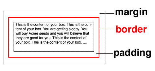
The Box Model
Boxes vs tables |
| Rather than using tables, and all those tedius table, tr, and td tags, we could use the CSS concept of the box. Using this box model, we can create a stylesheet that works off our p tags. |
The box model describes a rectangular box and the placement of material inside that box. The 3 essential properties that help us do this are:
On your screen, neither one of the black lines will show. The red border line will show if you have a border: 1px value in your stylesheet (or any value other than zero). |
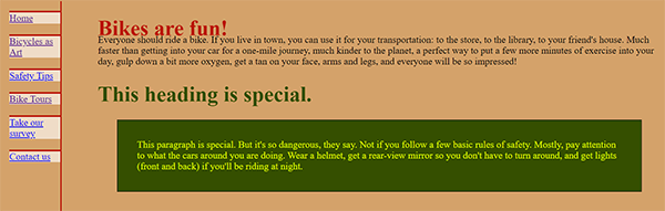
Remember our .spec1 style for changing the font color and boldness of text? We can make a new .spec2 style that can include the color, but also set the margins, padding, and border dimensions. Inside of your folder on the gavwebclass.com site, click on the little diamond shape in front of the name of the file (13.css), select 'edit' from the dropdown menu, then add the coding below: |
|
|
I've copied my .spec1 style, changed the name to .spec2, changed the font-weight to normal, and then set the margin at 2 em (1 em is the space taken up by the capital letter M), the padding at 2, and the border to solid, thin, and black. I've set the background color of the paragraph to dark blue, almost black. You'll want to change those border and background color codes. Remember those codes you picked out back in lesson 11. Try to repeat colors, or lighter or darker hues of already-used colors. Or leave out the background color. See how you like that effect. |
|
Next, I need to change the coding in 13.html, to use that new style: <h1 class="spec1">This heading is special.</h1>
|
 |
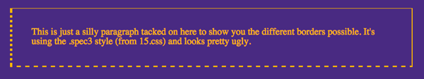
In Penelope's page, you can hardly see that single black line border against the dark green background, but you can change that to a different color, or erase the border completely so you'll get that floating, less-defined look. You can also set the style of the border to dotted, dashed, double, groove, ridge, inset and outset. border-style: double You can set the border width to thin, medium, or thick, or you can set the specific pixel thickness. border-style: groove; border-width: thick; You can also set each border (border-top, border-right, border-bottom, border-left) as a different style or thickness. .spec3 {border-width: 1px 2px 3px 4px; border-style: solid double dashed dotted;} That bit of coding will give you a one-pixel-wide solid top border, the right border will be a double line, 2 pixels wide; the bottom will be a dashed line 3 pixels wide, and the left margin will be a dotted line, 4 pixels wide. |
||
 | ||
There is a strict order for designating space around the screen. CSS always follows this order, and if you don't stick to it, you'll get into trouble: Top Right Bottom Left |
|
|
You can add as many different classes as you want. Just remember to
These styles will go into the css document.
|
.blue { And then you have to call up these classes in your html document: <p class="blue">Riding your bike will make you healthy, wealthy and wise....</p>
|
The Floating Concept |
|
| Instead of the boxed paragraphs, we could use floating elements to break up our page. You can float text or images to the left or right of your main body of text. Like img tags, these won't work with a center alignment. | |
You can add the coding on the right to your 13.css style sheet. This will give you a floating text box, to the left of your main body of text. The text in the main body will wrap around beneath the box if it is long enough. We first open a style called floatbox, give it a width and height, float it on the left side, and give it an orange background. The /*orange*/ is a comment tag. You can put comments anywhere in your document to help you keep track of what you're doing. The height of this box is set at 230 pixels, long enough for my image (179 px long), plus some space left over for text. For your own page, change this to fit the amount of words (or space needed by an image) you want to use. Otherwise, your words will spill out of the box and get printed over the main paragraph. We're also giving the box a padding, a margin and that same dark blue border of 3 pixels (repeating colors). Floatboxes let you put up images and text, so I've changed the color of the text to a darker purple: color: #54228C. This will show up better on my orange background color. |
.floatbox { width: 220px; height: 230px; float: left; background-color: #FFB700; /*orange*/ color: #54228C; padding: 1em; margin-right: 2em; border: solid #54228C 3px; } |
You can also float just an image, either to the right or left. You don't have to specify a size, like the floatbox class, but you don't get to add text either. That border color is another opportunity to pick up and repeat pieces of your color scheme Both of these styles get added to your 13.css stylesheet. |
.right {float: right; border: solid #54228C 3px; } |
In your 13.html document, you'll have to make these changes: Right after opening up the .content division, open the floating textbox. The <p> tag will do this, using the attribute class="floatbox". I've put in some words and an image. A simple closing </p> tag will get me out of the floating box. Right after that, I'll open up my floating image. Again, I simply add an attribute class="right", this time to the img tag, instead of a <p> tag. Floatbox classes get added to the <p> tag; right class gets added to the <img> tag. And then I continue on with the main content. |
<div class="content"> <p class="floatbox">Riding into the sunset<br> <img class="right" src="bike15d.jpg" width="200" height="323" |
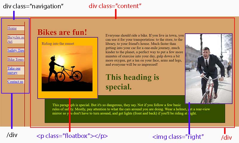
Here's what my home page will look like with these changes. I've changed the paragraph color to a lighter blue and put boxes around the different divisions to give you a clearer idea of how we designed it.
|
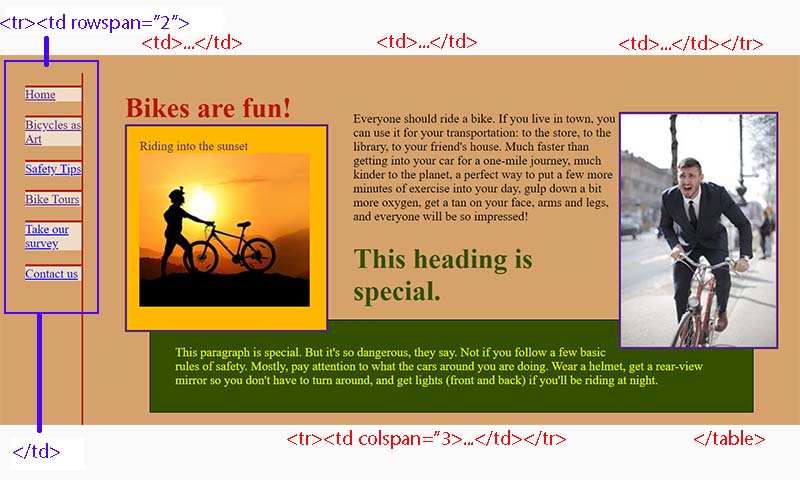
This is an illustration of how we would have divided the page using tables:
You can see that this could become much more tedious. It also illustrates the argument that using stylesheets allows you to code by design, what you want in each area, rather than by the layout constrictions of a table. |
 |
Conclusions about using CSS |
Sometimes though, it's just easier to whip out a table and forget the stylesheet business. There are several websites out there that have more information on stylesheets, how to form them, and how to use them.
|
|
Assignment |
||
Use the stylesheets here for modifying your two html documents: 13.html and
your second html page, and your one stylesheet document, 13.css,
from Lesson #14.
Remember to copy and paste as much as you can. This is not a typing class. You can see the coding for Penelope's page and the stylesheet changes at:
I've changed the names of Penelope's files to 15.html and 15.css. I've only done this so that our original 13.css and the pages that linked to that would stlll be available for examples. You don't have to rename anything. You can just modify the files that you have for assignments 13 and 14.
Find a dog or cat to pet. |
Address of this page:http://hhh.gavilan.edu/jhowell/csis6/15.html
Last updated
June 26, 2021
For questions please contact Jo Anne Howell at
jhowell@gavilan.edu